Some enterprises build a formal model governance practice in order to comply with industry standards such as CCAR (banking industry) or IFRS17 (insurance industry). Others know that building a sound predictive model governance discipline is a great idea to improve the quality of your business decisions. Here are some well-tested practices for ensuring three pillars of model governance: Stability, Performance and Calibration.
- Stability: Can I rely on the process that generates my enterprise data as stable and believeable?
- Performance: Can I predict the difference between good and bad outcomes, or between high and low losses?
- Calibration: Can I make those predictions accurately?
Stability evaluation
Corios has developed a package of characteristic and outcome stability measure reports that evaluate stability measures across time for any number of characteristics. These are illustrated in the two figures below. The first report focuses on a summary at two points in time: the original model development time period, and the current time period.
The next figure breaks the passage of time into discrete time periods, enabling the model creator, the model validator and the business owner to watch for the onset of model efficacy dilution.
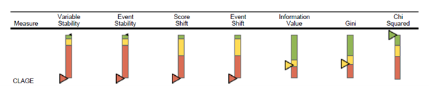
In the figures above, the development score for Gini and Information Value is calculated based on the records for the scorecard development sample; other development score statistics are selected from the first scoring period. The actual score is calculated based on the most recent scoring sample. The KPI charts present the development score as an upwards-facing black triangle, and the actual score as a downwards-facing triangle, in the color represented by the actual score comparison with the score benchmark. The score benchmarks are tied to the statistic in question and whether the model is application-based or behavior-based.
The definition of each of these measures is as follows:
- Event rate is ratio of events to accounts.
- Weight of evidence is a measure of the relative risk of an attribute, and is defined as the log of the ratio of the nonevent rate to the event rate per attribute value.
- Information value is event-to-nonevent proportion difference-weighted sum of the weight of evidence of the characteristic’s attributes.
- The Gini index is a measure of the characteristic’s ability to separate high-risk from low-risk accounts, defined by comparison of event and nonevent rates across ranked attribute bins.
- Pearson chi-square quantifies the difference between the development sample and current sample based on event proportion, and the chart displays the p-value of the chi-squared test.
- Rejecting the test’s null hypothesis means concluding that the two samples differ on event proportion.
- Variable stability compares the development and current samples on distribution of the attributes of a characteristic.
- Event stability compares the development and current samples on event proportion per attribute of a characteristic.
- Score shift compares the development and current samples on distribution of the score point-weighted attributes of a characteristic.
- Event shift compares the development and current samples on event proportion per score point-weighted attribute of a characteristic.
Performance and Calibration evaluation for binary outcomes
Binary outcomes are typically Probability of Default (PD) in the banking industry, and Claim Incidence in the insurance industry. These outcomes happen or they don’t, hence the term “binary” outcome.
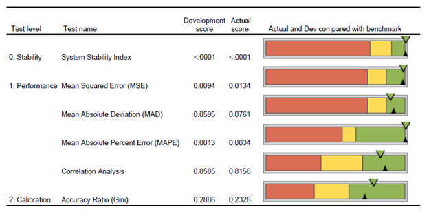
Corios has developed a package of binary model performance and calibration measure reports that evaluate binary model measures across time. A selected subset of these reports are illustrated in the figures below. The first report depicts a summary report for a selected set of measures for model stability, performance and calibration (i.e., some measures from this report are omitted in the interest of brevity) at two points in time: the model development time period and the most recent model evaluation period.
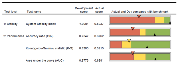
The development score is calculated based on the records for the scorecard development sample. The actual score is calculated based on the most recent scoring sample. The KPI charts present the development score as an upwards-facing black triangle, and the actual score as a downwards-facing triangle, in the color represented by the actual score comparison with the score benchmark. The score benchmarks are tied to the statistic in question and whether the PD model is application-based or behavior-based.
The next report illustrates system stability measures for a binary model over time. Economic climates and business environments change. These changes can influence population distributions and affect the performance of a scoring system. To determine if a scoring system can continue to be used effectively, the stability of the target population needs to be measured. SSI measures the degree of change within the target populations, by calculating an index. High index values indicate that the population has changed and may suggest that the scoring system needs re-calibration or re-development. Shifts in scorecard performance by score range may demand adjustments to score cut-offs.

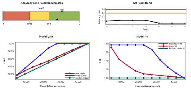
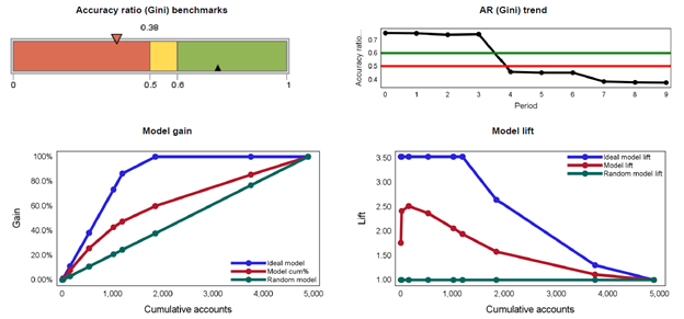
The next report below depicts Accuracy Ratio (AR), model gain and model lift measures over time. The gain curve is also known as the Gini curve, Power curve, or Lorenz curve. The gain curve is drawn by taking the cumulative percentage of all credit exposures on the horizontal axis and the cumulative percentage of all defaults on the vertical axis.
The Accuracy Ratio (AR) is the summary index of CAP and is also known as Gini coefficient. It shows the performance of the model being evaluated by depicting the percentage of defaults captured by the model across different scores. Concavity of a gain curve is equivalent to the property that the conditional probability of default, given the underlying scores, forms a decreasing function of the scores. A more concave curve indicates a better model. A perfect rating model will assign the lowest scores to the defaulters. In this case, the gain curve will increase linearly and then stay at 100%. For a random model without any discriminatory power, the percentage of all credit exposures with rating scores below a certain level (that is, the X co-ordinate) will be the same as the percentage of all defaulters with rating scores below that level (that is, the Y co-ordinate). In this case, the gain curve will be identical to the diagonal. In reality, rating systems will be somewhere in between these two extremes.
Lift charts consist of a lift curve and a baseline. The baseline reflects the effectiveness when no model is used and the lift curve reflects the effectiveness when the predictive model is used. Lift is a measure of the effectiveness of a predictive model calculated as the ratio between the results obtained with and without the predictive model. Greater area between the lift curve and the baseline indicates a better model.
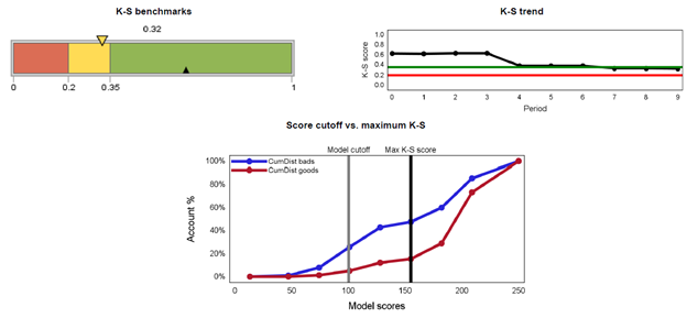
The next report below depicts the Kolmogorov-Smirnov (“K-S”) measures for a binary model over time. The K-S test is defined as the maximum distance between two population distributions. It provides the ability to distinguish healthy borrowers from troubled borrowers (usually taken as ability to discriminate defaults from non-defaults). It is also used to determine the best cut-off in application scoring. The best cut-off maximizes KS and hence it becomes the best differentiator between the two populations. The KS value can range between 0 and 100, with 100 implying the model does a perfect job in predicting defaults or separating the two populations. In general, a higher KS denotes a better model.
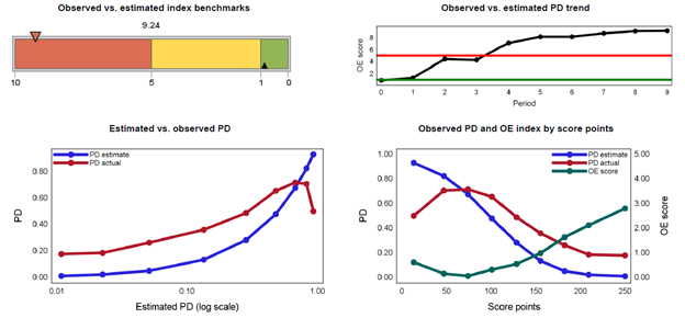
The next report below presents the first of several calibration measures, specifically the observed-estimated index. The observed vs. estimated index is a measure of closeness of the observed and estimated default rates. Hence, it measures the model’s ability to predict default rates. The closer the index is towards zero (0), the better the model performs in predicting default rates.
Performance and Calibration evaluation for continuously-measured outcomes
A “continuous measure” model focuses on the magnitude or volume of a business outcome, typically Loss Given Default (LGD) in banking and Claim Severity (such as, payout, recovery and expense) in insurance. If you measure this outcome in currency terms, it’s likely to be a continuous measure.
Corios has developed a package of binary model performance and calibration measure reports that evaluate binary model measures across time. A selected subset of these reports are illustrated in the figures below. The first report depicts a summary report for a selected set of measures for model stability, performance and calibration (i.e., some measures from this report are omitted in the interest of brevity) at two points in time: the model development time period and the most recent model evaluation period.
The development score is calculated based on the records for the scorecard development sample. The actual score is calculated based on the most recent scoring sample. The KPI charts present the development score as an upwards-facing black triangle, and the actual score as a downwards-facing triangle, in the color represented by the actual score comparison with the score benchmark. The score benchmarks are tied to the statistic in question and whether the model is application-based or behavior-based.
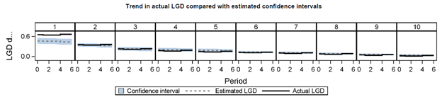
The next report below presents a summary of interval model performance, specifically actual loss given default (LGD) performance for 10 pools of loans at a point in time after the loans have matured. Correlation is the Pearson correlation coefficient between average and estimated LGD calculated at the pooled level. Confidence intervals are based on pool-level average estimated LGD plus/minus the pool-level standard deviation multiplied by the 1-(alpha/2) quantile of the standard normal distribution.
The last report below illustrates measures of model lift for an interval level model at multiple time periods. This analysis examines LGD events, defined as the proportion of cases per pool where actual LGD exceeds estimated LGD. The gain curve is also known as the Gini curve, Power curve, or Lorenz curve. The gain curve is drawn by taking the cumulative percentage of all accounts (in descending order of LGD volume) on the horizontal axis and the cumulative percentage of all LGD events on the vertical axis. The higher the gain curve, the higher the relative proportion of LGD events per pool.
The Accuracy Ratio (AR) is the summary index of CAP and is also known as Gini coefficient. It shows the performance of the model being evaluated by depicting the percentage of LGD events captured by the model across different scores. The higher the AR curve, the higher the relative proportion of LGD events per pool.
Lift charts consist of a lift curve and a baseline. The baseline reflects the effectiveness when no model is used and the lift curve reflects the effectiveness when the predictive model is used. Lift is a measure of the effectiveness of a predictive model calculated as the ratio between the results obtained with and without the predictive model. Typically, greater area between the lift curve and the baseline indicates a better model. In this case, because this analysis examines LGD events, the greater the area between the lift curve and the baseline indicates a higher incidence of LGD events, and hence a model that is more likely to under-estimate the actual number of such events.